If eyes are the window to the soul, then content is the window to your website’s effectiveness. That’s why our Content Scorecard is such an effective tool for evaluating and benchmarking your content marketing efforts.
Content is obviously the backbone for content marketing. But we’ll take that a step further and say content is truly the basis for any marketing initiative. You can’t host a website, post to social media, or advertise without content, right?
And while we can’t tell you what to write (unless we’re working with you ;-), our Content Scorecard will help you with tactical points on how to structure and present your website content. So let’s dive in.
Why you need to evaluate both content AND conversion elements
We’ll look at your content through two different lenses: The content itself, and then the conversion elements, which help you achieve the goal of your website, such as requesting a demo, or signing up for a newsletter.
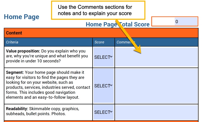
The three columns on the scorecard include criteria, score and comments. On our downloadable Content Scorecard, the score and comments boxes will be blank, but in this post we’ll use the comments section to explain what you should look for with the criteria.
For the score, we use a 1-5 rating based on our observed best practices.
1 = Never
2 = Rarely
3 = Sometimes
4 – Often
5 = Consistently

Evaluating three areas on your website: Home page, product page, blog page
You can make the argument that your Content Scorecard should focus on more than just your website. Content can include your social media posts, guest posts, presentation decks, infographics — all things we may consider for Content Scorecard 2.0. (Subscribe to our blog to receive those!)
For now, we’ll focus on your website and three critical areas: your home page, a product/service page, and a blog page.
Home page
One of the most popular pages on any site, the home page is usually the destination of direct and referral traffic. These are people coming to your site to check it out for the first time or are making a return visit.
Direct traffic is counted as people who type your URL into a browser, and referral traffic comes from a link to your site, typically to the home page.
Goal: Segment — Much like the receptionist at a brick-and-mortar HQ, your home page should direct people to the specific place they want to go.
| Content | ||
| Criteria | Score | Comments |
| VALUE PROPOSITION: Do you explain who you are, why you’re unique and what benefit you provide in under 10 seconds? | 3 | This should be the first headline people see at your home page. Here's a great post on how to write a value proposition. |
| SEGMENT: Your home page should make it easy for visitors to find the pages they are looking for on your website, such as products, services, industries served, contact forms. This includes good navigation elements and an easy-to-follow layout. | 4 | Remember, the goal of your home page is to segment and help people get to where they want to go ASAP. |
| READABILITY: Skimmable copy, graphics, subheads, bullet points. Photos. | 3 | People who read on the Internet skim. Make sure there is no friction in the visual elements-no small print to hold you up. Clarity in your prose, clean visual design. |
| Conversion | ||
| Criteria | Score | Comments |
| SOCIAL PROOF: Case studies, reviews, testimonials, credentials? | 3 | For B2B sales, nothing is as important as case studies. It’s your social proof--like Google review. You can definitely intersperse testimonials throughout as well. Here’s a post on how to write a great case study. |
| CALL-TO-ACTION (CTA) EFFECTIVENESS: Contrasting color, clear reason why. | 2 | These include call-to-action buttons and clear headlines that encourage people to take the next step. What's the thing you really want them to do? |
| MEASUREMENT: Do you have analytics that track CTA conversions / actions by either tracking the thank you page or a success message? | 2 | This is all about measurement. When you fill out a form, are you taken to a "Thank you" page? It's double-checking to make sure you are measuring conversions and the effectiveness of your marketing. |
Product / service page
Visitors will reach these pages via web searches or from your home page. These are transactional pages — visitors are coming here to purchase a product or service.
Goal: Sell — Your language here will focus on benefits to the consumer and ultimately on getting them to BUY! You’ll also want to feature social proof that backs a purchase.
| Content | ||
| Criteria | Score | Comments |
| 10-SECOND TEST: Product clearly stated, what sets it apart. | 4 | Just like the home page, you need a value proposition that sets your product or service apart. |
| NEUROSCIENCE: Do you identify pain points and play to emotional appeal? | 3 | Are you clearly identifying a pain point early in the page? Don’t talk about benefits and features until you identify how this helps--get to an emotional level. Push their buttons! |
| DATA-DRIVEN: Any data to back up claims, showcase effectiveness of the product? | 4 | Content that appeals to emotion appeals to the right brain thinkers, but data points will convince the left brain thinkers, who strive to make logical decisions. |
| READABILITY: Bullet points, skimmable copy, graphics used throughout. | 3 | Just like the home page, we want to write for skimmers. |
| Conversion | ||
| Criteria | Score | Comments |
| SOCIAL PROOF: Case studies, reviews, testimonials, credentials? | 1 | This is a great place to insert a testimonial, or even an on-screen case study or video. |
| CONTACT INFORMATION SUBMISSION FORM: Gather all the information you need for your sales team to engage with a customer. | 3 | One great technique we’ve found is to insert a submission form on a product / service page instead of taking someone to a separate landing page. Ask for their contact info right away! |
| MEASUREMENT: Do you have analytics that track CTA conversions / actions by either tracking the thank you page or a success message? | 3 | Again, you want to ensure you’re measuring completed goals here. You should also be testing these forms monthly to make sure leads are coming through, and you don’t have any glitches on your website. |
Blog page
Visitors will reach these pages via long-tail search terms or via your eNewsletters (providing you have one). These visitors are looking for information, not purchases. For example, “Why should I have a blog?” might be a good topic to cover in a content marketing blog.
Goal: Inform — You don’t want to push sales here. You want to educate and answer questions.
| Content | ||
| Criteria | Score | Comments |
| QUALITY DEPTH: Posts should be above the 1,500-word threshold. (More in-depth posts typically gain more shares and inbound links.) | 2 | You’ll definitely want to check out this study on what drives results in a blog. But the more in-depth posts prove to generate more shares and links. |
| TONE: Blog content should be informational; doesn’t include a sales pitch. | 1 | It’s going to be hard to resist, especially when you get heat from your sales and management team. But you want to inform, not sell. Otherwise, you’ll scare folks off. |
| SOCIAL-READY: Include sharing buttons to social media. | 1 | Make it easy to get the word out. No need to include all share buttons -- focus on the networks you’re active on. |
| CONSISTENCY: Regular, predictable posting. | 1 | If there’s been one thing linked to success for us, it’s publishing regularly. Keep it consistent. |
| COLLABORATIVE: Collaborate with other experts on content. | 2 | Engage outside experts in your content, especially within your industry. They’ll share your content with their networks. |
| READABILITY: Scannable content. Subheads, graphics per every scrollable fold, images, font large enough, bullet points, appearance on mobile. | 3 | Walls of text are the biggest hindrance to blog writers. Make sure you are breaking paragraphs up every 1-3 lines. |
| PERSONAL BRANDING: Include bio and picture of your company writer in bio. | 1 | People love to see who is writing the posts and to put a face with a company name. |
| Conversion | ||
| Criteria | Score | Comments |
| LIST BUILDING: Pop-up window? Subscription form? | 1 | You can either lead people deeper into your website, or encourage them to subscribe to your blog. We like using a pop-up window, typically having it appear after someone has scrolled down the page and engaged with the content. |
| CALL-TO-ACTION (CTA) EFFECTIVENESS: Contrasting color, clear reason why. | 2 | You can also include a call-to-action button taking them to a downloadable offer linked to the content of the post. Check out our offer for a downloadable version of this PDF! |
| MEASUREMENT: Do you have analytics that track CTA conversions / actions by either tracking the thank you page or a success message? | 1 | Again, are you including a Thank you page, or are you sure you’ve got conversion actions being measured through Google Tag Manager? |
Wrap it up with overall comments and questions to consider
At the end of our Content Scorecard, we like to leave some overall comments about the content and conversion elements on the site. What are the big takeaways? What was the user experience like? This can help you adjust the overall impact of the website.
We also serve up some questions to consider from a strategic viewpoint:
Examples of questions to consider: Have you considered converting your white paper PDFs into blog posts / web pages? What are you doing for top-of-funnel content and list building? How can you showcase your people? How do you prove your performance? How can your overall site reflect your value prop?
We’ll leave you with one final thought: The goal of this scorecard isn’t to criticize where you are now. It’s to provide you with a clear direction of what your next steps should be, and how to benchmark yourself moving forward. So fill in your scorecard NOW!

